Poe Poetry :: From “Israfel”
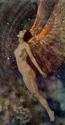
I recently added some amazing Public Domain Images that Edmund Dulac illustrated for a collection of poems by Edward Allan Poe. The book is The Poetical Works of Edgar Allan Poe and was published in 1921 by George H. Doran in New York. Dulac’s dark and shadowy paintings fit the mood of Poe’s poetry perfectly. Even when Poe appeared to be trying to write a love poem or something “uplifting,” he just doesn’t quite seem to pull it off. There’s always this melancholy gloom that seem to hang over his work, which Dulac captures beautifully.
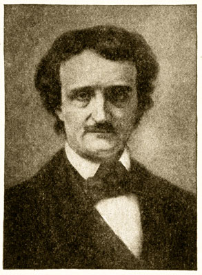
Edgar Allan Poe Pictures :: Portrait
I found this great little biography of Poe’s life in the 1911 edition The Encyclopedia Britannica that I thought I’d share.
Edgar Allan Poe, American poet, writer of fiction and critic, was born in Boston, Massachusetts, on the January 19, 1809. The family was of English origin, but was settled in Ireland, before the poet’s great-grandfather emigrated to Maryland. His grandfather, David Poe, served with credit as a soldier in the War of Independence, was known to Washington, and was the friend of Lafayette.
His son David Poe was bred as a lawyer, but deeply offended his family by marrying an actress of English birth and by going on the stage himself. In 1811 he and his wife died, leaving three children—William, Edgar, and a daughter Rosalie—wholly destitute. William died young, and Rosalie went mad.
John Allan a tobacco merchant of Scottish extraction adopted Edgar, seemingly at the request of his wife, who was childless. The boy was indulged in every way, and encouraged to believe that he would inherit Mr. Allan’s fortune. Mr. Allan, having come to England in 1815, placed Edgar in a school at Stoke Newington in England, kept by a Dr. Bransby. In 1820 Mr. Allan returned to Richmond, Virginia, and Edgar was first placed at school in the town and then sent to the University of Virginia at Charlottesville in 1826.
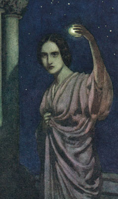
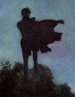
Poe Poems :: From “To Helen”
Here the effects of a very unwise training on a temperament of inherited neurotic tendency were soon seen. He was fond of athletics, and was a strong and ardent swimmer, but he developed a passion for gambling and drink. His disorders made it necessary to remove him, and Mr. Allan, who refused to pay his debts, took him away.
Edgar enlisted on the 26th of May 1827 in Boston, and served for two years in the United States army. As a soldier his conduct must have been exemplary, for he was promoted sergeant-major on the 1st of January 1829. It is to be noted that throughout his life, when under orders, Poe could be a diligent and capable subordinate. In May 1820, Mr. Allan secured Edgar’s discharge from the army, and in 1830 obtained a nomination for him to the West Point military academy. As a student, Edgar showed considerable faculty for mathematics, but his aloofness prevented him from being popular with his comrades, and he neglected his duty. When court-martialed for missing drills, parades, classes and church, he made no answer to the charges, and was expelled on the 6th of March 1831.
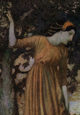
Edgar Allan Poe :: From “To the River”
Mr. Allan’s generosity was now exhausted. The death of his first wife in 1820 had doubtless removed any influence favorable to Edgar. A second marriage brought Mr. Allan children, and at his death in 1834, Mr. Allan left his adopted son nothing. A last meeting between the two, shortly before Mr. Allan’s death, led only to a scene of painful violence.
In 1827 Poe had published his first volume of poetry, Tamerlane and other Poems, in Boston. He did not publish under his name, but as “A Bostonian.” In 1831 he published a volume of Poems under his name in New York. His life immediately after his departure from West Point is very obscure, but in 1833 he was living in Baltimore with his paternal aunt, Mrs. Clemm, who was his protector throughout his life, and, in so far as extreme poverty permitted, his support.
In 1833 he won a prize of $100 offered for the best story by the Baltimore Saturday Visitor. He would have also won the prize for the best poem if the judges had not thought it wrong to give both rewards to one competitor. The story, “MS. Found in a Bottle,†is one of the most mediocre of Poe’s tales, but his success gave him an introduction to editors and publishers, who were attracted by his striking personal appearance and his fine manners, and who were also touched by his manifest poverty.
From 1833 till his death he was employed at different magazines in Richmond, New York, and Philadelphia. His famous poem “The Raven,” was published first in 1845, and soon became extraordinarily popular, but Poe received barely any money for it.
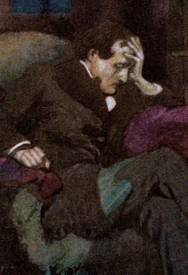
Dulac :: From “The Raven”
The facts of Edgar Allan Poe’s life have been the subject of very ill-judged controversy. The acrimonious tone of the biography by Rufus Griswold, prefixed to the first collected edition of his works in 1850, gave natural offense, and attempts have been made to show that the biographer was wrong as to the facts. But it is no real kindness to Poe’s memory to deny the sad truth that he was subject to chronic alcoholism. He was not a gracious companion, and never became callous to his vice. When it seized him he drank raw spirits, and was disordered by a very little. But when he was free from the maddening influence of alcohol he was gentle, well bred, and a hard worker on the staff of a magazine, willing and able to write reviews, answer correspondents, propound riddles or invent and solve cryptograms. His value as a contributor and sub-editor secured him successive engagements on the Southern Literary Messenger of Richmond, on the New York Quarterly Review, and on Graham’s Magazine at Philadelphia. It enabled him in 1843 to have a magazine of his own, the Stylus. However, Edgar’s mania sooner or later broke off all his engagements and even ruined his own venture.
In 1835 he married his cousin, Virginia Clemm, a beautiful girl of fourteen years of age and Mrs. Clemm’s daughter. A false statement as to her age was made at the time of the marriage. She died of consumption (tuberculosis) in 1847 after a long decline. Poe made two attempts to marry women of fortune—Mrs. Whitman and Mrs. Shelton. The first of these engagements was broken off. The second was terminated by his death in a hospital in Baltimore, Maryland, on the 7th of October 1849.
Poe’s life and death had many precedents, and will always recur among Bohemian men of letters and artists. What was individual in Poe, and what alone renders him memorable, was his narrow but profound and original genius. In the midst of much hackwork and not a few failures in his own field, he produced a small body of verse and a handful of short stories of rare and peculiar excellence. The poems express a melancholy sensuous emotion in a penetrating melody all his own. The stories give form to horror and fear with an exquisite exactness of touch, or construct and unravel mysteries with extreme dexterity. He was a conscientious literary artist who revised and perfected his work with care. His criticism, though often commonplace and sometimes ill-natured, as when he attacked Longfellow for plagiarism, was trenchant and sagacious at his best.
What a great, tragic story. Has anyone done a movie about his life? It seems to have all the perfect elements: orphans, love, death, scandal, addiction, poverty. Why, Poe’s life could have been written by Dickens!
Here’s one of my favorite poems by Poe; it’s a great complement to the biography.
Alone
From childhood’s house I have not been
As others were; I have not seen
As others saw; I could not bring
My passions from a common spring.
From the same source I have not taken
My sorrow; I could not awaken
My heart to joy at the same tone;
And all I love I loved alone.
Then—in my childhood, in the dawn
Of a most stormy life—was drawn
From every depth of good and ill
The mystery which binds me still:
From the torrent, or the fountain,
From the red cliff of the mountain,
From the sun that round me rolled
In its autumn tint of gold,
From the lightning in the sky
As it passed my flying by,
From the thunder and the storm,
and the cloud that took the form
(When the rest of Heaven was blue)
Of a demon in my view.
Dulac Illustrations :: From “Alone”