Coat of Arms

Family Coat of Arms

Coat of Arms Templates


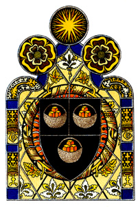
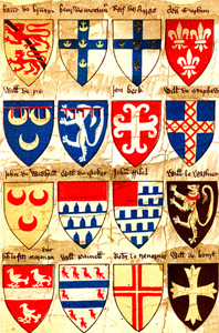
Family Coat of Arms ~ Part of an early roll of arms belonging to the Society of Antiquaries of London

On yesterday’s Heraldry post, I began sharing the introduction to W. H. St. John Hope’s 1913 book, Heraldry for Craftsmen and Designers. I’m going to continue today with the section about the designs and devices that appear on a coat of arms. Note: I’ve added some of my own notations in the text between brackets when I didn’t understand what the author was referring to. I got my additional information from this excellent article Coat of Arms at Wikipedia.

Mr. St. John Hope writes:

In the formation of arms the mere combinations of colours and metals produced by vertical, horizontal, or other divisions of the shield were soon exhausted, as were quarters, checkers, etc. There accordingly grew quite naturally the further use of applied strips or bands based upon such divisions.

Coat of Arms Templates

Coat of Arms Templates


Coat of Arms Templates

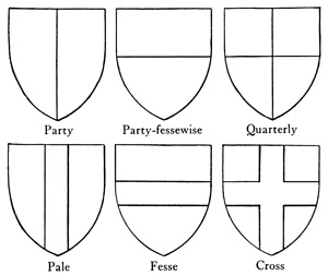
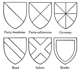
Thus the vertical parting of a metal and a colour known as party [see image above] produced the pale, and a horizontal division the fesse or bar, and these combined to form the cross suggested by the quarterlines. An oblique or slanting parting gave rise to the bend, and the crossing of two such produced the St. Andrew’s cross or saltire. A combination of the lines of a saltire with a quarterly division produced the varied field called gyronny. The border almost suggested itself. See image below.

Blank Coat of Arms

Blank Coat of Arms


Blank Coat of Arms

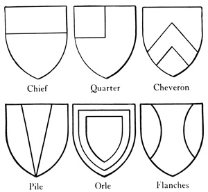
A cutting off of the upper half or head of the shield yielded the chief, and of the fourth part the quarter. One other of these applied pieces, or ordinaries [a simple geometrical figure, bounded by straight lines and running from side to side or top to bottom of the shield] as they were called, was the cheveron, formed of two strips issuing from the lower edges of the shield and meeting in a point in the middle, like the cheverons forming the roof timbers of a house. Another ordinary was the pile, which was often threefold with lines converging towards the base. See below.

Printable Coat of Arms

Printable Coat of Arms


Printable Coat of Arms

Sometimes a shield was charged [making use of any emblem or device occupying the field of a shield] with one of a smaller size called a scutcheon, and the middle of this was occasionally cut out to form a voided scutcheon or orle. Flanches, as they are called, are very rarely found; they were formed by drawing in-curving lines within each side of the shield.

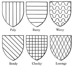
An even series of pales yielded a vertical striping called paly, and of piles, pily, while an even number of bars became barry. Undulated or waved bars formed wavy, and sometimes paly and pily stripes were also waved. See below. In early examples the bend was often bended or curved. Bends were so represented in one of the shields in Westminster Abbey, in some of the shields over the nave arcades in York minster, and a number of monumental effigies. A narrower bend which overlaid everything was known as a baston. A number of narrow bends produced a bendy, but the lines were then straight. A field divided into squares or checkers formed checky, and when it divided into what are now called lozenges it became lozengy. See below.

Shield Templates

Shield Templates


Shield Templates

Pales, fesses, crosses, saltires, borders, and cheverons sometimes had their edges engrailed by taking out of them, as it were, a continuous series of bites separated by sharp points, and the lower edge of a chief or the inner margin of a border was often indented like the edge of a saw; but in early heraldry engrailing and indenting were interchangeable terms. An indented fesse was anciently called a daunce. Cheverons, fesses, bars, etc. were occasionally battled, through the upper line being formed into battlements. A fesse was often placed between two cheverons, as in the well-known arms of FitzWalter; or between two very narrow bars called cotises, or pairs of cotises called gemell bars. Cheverons, bends, and pales were also sometimes cotised. Cotises were often of a tincture different from that of the ordinary which they accompanied, and sometimes indented or dancetty as in the arms of Clopton and Gonvile. The ground or field could be relieved by the use of vair or ermine, or by the addition of fretting or trellis work or other simple means. It was also not unfrequently powdered with small crosses, fleurs-de-li, or billets; often in conjunction with a larger charge like a cinqfoil or a lion.
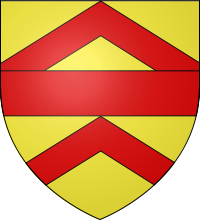
FitzWalter Coat of Arms

FitzWalter Coat of Arms


FitzWalter Coat of Arms with Cheverons and Fesse from Wikimedia Commons

Almost from the beginning every kind of device [coat of arms] was charged or painted upon shields, either singly or in multiple, and upon or about such ordinaries as crosses, cheverons, and fesses. Birds, beasts, and fishes, and parts of them, like heads, or feet, or wings; flowers, fruits, and leaves; suns, moons or crescents, and stars; fleurs-de-lis, crosses, billets, roundels, rings, etc. all were pressed into service. The great rule as to colour held good as regards charges, and it was not permissible to paint a red rose upon blue or a gold star upon silver; but a red rose upon gold or a silver star upon blue was quite right.

It has however been lawful at all times to place an ordinary, such as a fesse or a cheveron, and whether charged or not, upon a parti-coloured field like quarterly, checky, paly or barry, or upon vair or vairy. A quarter or a chief, or a border without reference to its colour, can also be added to any such field.

Conversely, a parti-coloured cross, fesse, or charge of any kind, is allowable upon a plain field.


Wow! It’s like trying to learn another language! Can you imagine the skill it took for craftsmen to design a coat of arms?

To be continued . . .


Heraldry

Heraldic Art

Heraldic Art


Heraldic Art ~ Arms from Ibberton Church, Dorset, circa 1475

About a year and a half ago, I purposefully walked into Copperfield’s Books in Sebastapol hunting for treasure. My sister Kris knows that no matter where we go, I’m inevitably going to drag her into a used bookstore. Thankfully, she has patience. I found a very worn out, unassuming book on the shelf– The Artistic Crafts Series of Technical Handbooks: Heraldry for Craftsmen and Designers by W. H. St. John Hope, copyright 1913. I opened it up and saw that it was full of amazing colored plates, engravings, and hand-drawn images of heraldry and coats of arms, among other things. I’ve just finished preparing about ninety images for the Public Domain Images part of my web site. The introduction to the book is fascinating, so I though I’d share some of it with you over the next few posts.

Family Coat of Arms

Family Coat of Arms


Family Coat of Arms ~ An early roll of arms belonging to the Society of Antiquaries of London

From the Introduction, Mr. St. John Hope writes:

Heraldry, or armory as it was anciently called, is a symbolical and pictorial language of uncertain and disputed origin, which, by the beginning of the thirteenth century, had already been reduced to a science with a system, classification, and nomenclature of its own. The artistic devices known as arms, which may be formed by proper combination of the colours, ordinaries, and figures that represent the letters of this language, had each their significance, and soon came to be regarded as the hereditary possession of some person, family, dignity, or office.

The display of arms was restricted primarily to shields and banners, but occasionally to horse trappers and such garments as jupes, gowns, and mantles. Later on heraldry came also to be used ornamentally, either upon shields or without them, in all kinds of ways, in architecture and on monuments, on tiles and in glazing, in woodcarvings and in paintings, in woven stuffs and embroideries, in jewellery and on seals.

The colours used in heraldry are red, blue, green, purple, and black, or to give them their old names, gules, azure, vert, purpure, and sable; combined with the yellow of gold and the whiteness of silver. Orange was never used, probably on account of the difficulty of finding a stable pigment. It was soon found that for brilliancy of effect the use of gold or silver with a colour was preferable to that of colour with colour or metal with metal; two colours are therefore found together or superposed only under certain conditions, and the same applies to the two metals.

Imitation of two furs, ermine and vair, were also used: the one of white flecked with little black tails; the other of alternating oblong patches of white and blue, square at the top and rounded at the bottom, to represent grey squirrels’ skins. If vair were colored other than white and blue, the resultant was called vairy. There is also known a black fur with silver ermine-tails.

There were never any exact rules as to the particular tint of the colour employed, that being simply a matter of taste. Thus blue may range from a full indigo almost to Cambridge-blue, and red from a bright scarlet, through vermilion, to a dull brick colour, and so on; and it is surprising to find how well quiet colours blend together.

Tomorrow, I’ll continue by sharing the part of the introduction that discusses the various types of heraldry designs.


Lettering and Librivox

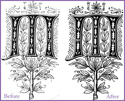
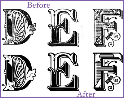
I spent the last three months scanning, enhancing, resizing, and creating the web pages for over 660 letter images for the Public Domain Images section of my web site. Nearly every letter had to be redrawn, since the quality of the scans from these old books and magazines, when resized to large dimensions, were not very good. It was a big job, but I enjoyed the process.

One thing that helped to make this an enjoyable experience for me was my discovery of Librivox, where I was able to listen to classic literature online. Being an English major and teacher, I have always felt a little guilty about not reading some of the books from those “must read” classic literature lists. So I found this to be the perfect opportunity to read/listen to these great novels. I could redraw the alphabets while listening to volunteers from around the world read public domain books. I listened to The House of Mirth by Edith Wharton and Sense and Sensibility by Jane Austen both narrated by the wonderful Elizabeth Klett. I listened to Pride and Prejudice, another Jane Austen classic, read by Annie Coleman, as well as another Wharton favorite, The Age of Innocence read by Brenda Dayne. I also managed to listen to the 49 hour reading of The Count of Monte Cristo by Alexandre Dumas, and then Dickens’ A Tale of Two Cities, both read by a variety of different readers. I discovered that I enjoyed readings by single narrators rather than a variety of different readers because single readers often use distinct voices for the various characters, which helped me to keep the characters straight in my head.

What an amazing resource Librivox is. I am so grateful to the wonderful readers who took the time to volunteer to read these stories. I’m half way through Great Expectations and am looking forward to finishing it when I start working on my next round of images!


I’m Back!

Before you start reading this, jump to the end and press play on the Animoto slide show. That way it will be loaded and ready to play by the time you get to the end of this post.

What an intense, busy year this has been for me. My art took a back seat to my goal for the year, which was to get my master’s degree in educational technology. I had to take six classes, write a huge paper and create a field project, so that’s what I’ve been working on for the last twelve months. I finished a little over a week ago. It was a great experience for me; I learned so much! But it was hard work and left no time for making art or writing.

I’m starting my twenty-fourth year of teaching in a little more than a week. I’m excited to use what I learned this past year with my students. There are so many new things I want to try with them that I feel a little nervous and overwhelmed about it. I have to remind myself to start small and focus on adding new ideas and content in little steps so I don’t lose my mind.

Even though I feel like I spent all my waking hours working on my master’s project this summer, I did take time to do a few fun things. Michael and I went to Monterey to watch the motorcycle races at Laguna Seca. I didn’t think I would like it very much, and was basically going to keep him company. When he was a young boy in Greece, he would read the motorcycle magazines and dream about going to Laguna Seca to watch the races. After 24 years of living in the U.S., we finally made his dream come true! And it was a blast! I had a great time and would definitely go again without hesitation. I’ll write some more about that trip in another post.

I also took the kids to see the Coldplay concert at the Shoreline Amphitheater in Mountain View. What a great concert they put on. They played for two solid hours. A highlight for me was an acoustic version of Michael Jackson’s “Billy Jean,” which was just amazing. The only downside was the traffic getting there, which was horrendous. I like the Shoreline because it’s a medium sized venue and you don’t feel like you’re watching ants on a stage. However, our seats were awful. I bought the tickets online and when I got them I noticed tiny print that said “Possible Obstructed View.” Huh?? Believe me, if I had known that, I wouldn’t have bought the tickets, especially not for the price they charged. Or I would have tried for different seats. Live Nation said that we could return them, but the show was sold out and I really wanted to go, so we took our chances. Good thing everyone stood up for the entire concert. We were two rows up from a huge projector that totally blocked our view of the stage when we were sitting down. Shame on Live Nation for selling us those tickets in the first place. The traffic and the crappy seats were disappointing, but ultimately Coldplay’s fantastic performance and music made up for it.

My family also got to spend four days at Bass Lake near Yosemite. My sister’s family invited us to join them. The water in the lake was warm and beautiful and we rented a party boat and took the kids tubing. My sister, Kris, eventually talked me into going tubing, too. Boy am I glad she did! It was so much fun; I haven’t laughed that hard in I don’t know how long. We also took a drive to Yosemite Valley for the day. That place is so incredible. I’ve been there at least six times in my life and it never ceases to amaze me.

Another fun thing I did this summer was go to the Italian Street Painting Festival in San Rafael. It’s a fund raiser for the Youth in Arts program. The city closes off several streets and uses blue tape to mark off huge squares on the asphalt for artists to use as their canvas. It’s a two day thing, and I have to say that I like going Saturday to see the work-in-progress. The half-finished faces look like they’re rising out of the pavement. I don’t know how the artists do it. They must be so sore the next day. They do all their drawing with chalk while on their knees or crouched over the art. There were lots of hats, and kneepads, and I bet lots of Motrin the next day . . . at least I know there would have been for me. The art work is amazing. I took lots of pictures and used Animoto to make a little video to share with you. If you’ve read this far, hopefully the movie has loaded into the page by now. I hope you enjoy it.


Create your own video slideshow at animoto.com.


Gaudi’s Park Guell

I was thinking about Barcelona yesterday. I spent four amazing days there in the summer of 2007. Long enough to get a tantalizing taste, and short enough not to become disillusioned. Yes, I had a love affair with Barcelona. I think about her often. I would live with her if I could, but alas, it is not to be. This is strictly a long-distance relationship, fed by memories and photographs, some of which I’m going to share with you today.

One of my favorite things about Barcelona is the art and architecture, which through the work of Antonio Gaudi, become inextricably connected. I’m just going to share a few photographs from one of my favorite Gaudi designs – Park Guell.


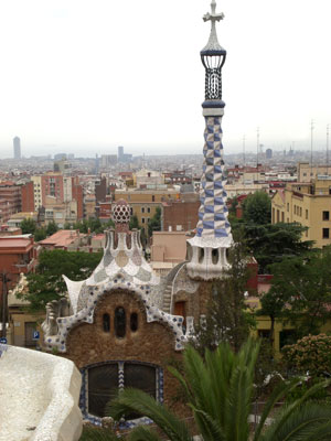
Porter’s House – Park Guell

My dad and I took a subway ride and made a steep climb to the top of Carmel Hill to get there. As you can see in the picture above, the view is amazing from the top, even on this hazy day.

Park Guell was built between 1900 and 1914. It was originally supposed to be a community of luxury homes, but the development failed, and the land was purchased by the local government and turned into a park. Lucky us!

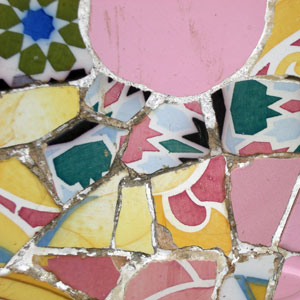
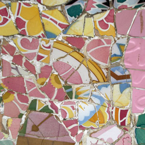
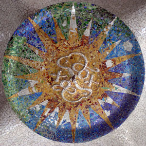
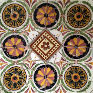
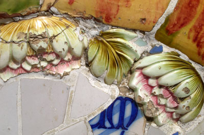
There are winding paths, terraces, gardens, vaulted ceilings, and colonnades. Many of the surfaces are covered with colorful ceramic tiles. Apparently, they were made from plates and pottery that Gaudi and his workers smashed into small pieces and then used to create intricate mosaics atop many of the park’s structures.

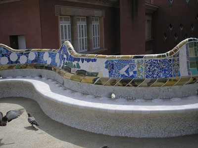
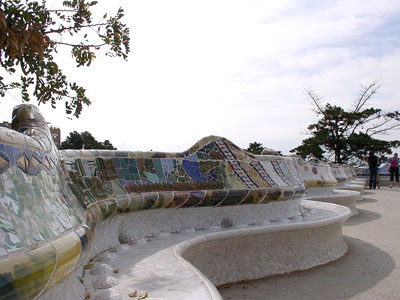
One of my favorite parts of Park Gruell is the undulating bench on the upper terrace. You can really get a close up look at the beautiful ceramic tile work, as shown in the images below. One can only imagine the amount of time and patience it took to create the bench alone. Unfortunately, I was so focused on the details, I didn’t take a single long-shot view of the bench, so I’ve included a couple here from Wikipedia Commons so you can get an idea of what it’s like.


Photo by Deror Avi from Wikipedia


Photo by Baikonur from Wikipedia


Here are some close-up images I took of the tile work at Park Guell.


Here’s a nice little homemade video of the park by Dennis Callan.